Minimalist Label Design & Alternative Styles to Elevate Your Packaging

Minimalist Label Design & Alternative Styles to Elevate Your Packaging

In the marketing thing, a label is more than just an identity marker. Its primary role is to attract consumer attention and visually convey key product information. The right label design can create a strong first impression and influence purchasing decisions within seconds. There are  two major approaches commonly used in label creation; minimalist and maximalist design. Each has its own characteristics and effectiveness, depending on the context in which it’s applied.

In today’s fast-paced market, visual appeal plays a major role in influencing consumer decisions. One of the most prominent trends right now is minimalist design. This style is favored for its clean look, clarity, and simplicity. For many brands, a minimalist approach delivers a modern, premium, and professional impression.

However, that doesn’t mean every product should follow the same path. Each brand has its own character and audience. For those with a more expressive or energetic identity—or for products that need to stand out on store shelves—maximalist design may be the better choice. Understanding this distinction is essential before deciding on the right visual direction for packaging.f

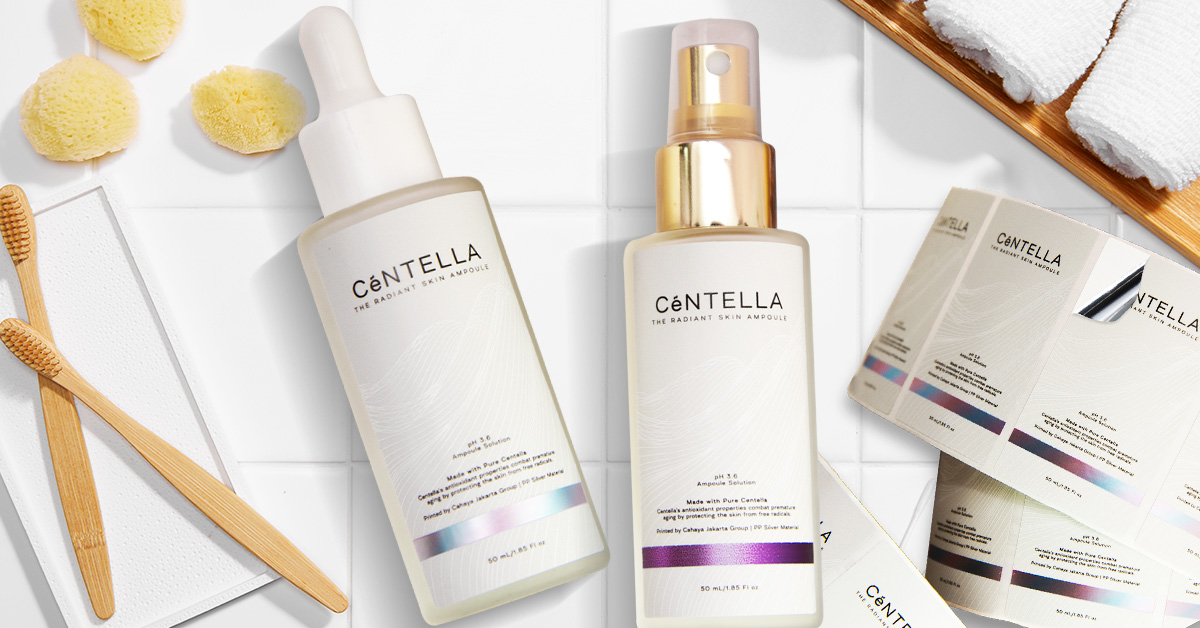
What is Minimalist Label Design?

Minimalist label design emphasizes simplicity. Its main features include the use of limited elements, generous white space, and clean, easy-to-read typography. The colors used are generally neutral—such as black, white, or soft pastel palettes. The main focus of this design approach is functionality and clarity in delivering messages without excessive visual distractions.

Advantages of Minimalist Design:

  • Easy to read and recognize: Simple elements make key information stand out without visual clutter.
  • Creates an exclusive and professional impression: This style is suitable for premium products, cosmetics, and modern lifestyle needs.
  • Resilient to design trends: Clean, timeless visuals are less likely to feel outdated.

Disadvantages of Minimalist Design:

  • Less conspicuous on store shelves: Among visually bold products, minimalist labels may get overlooked.
  • Risk of appearing too plain: Without proper execution, the design might feel flat or uninteresting.

While minimalist design offers many advantages, it doesn’t always suit every product or brand. Some brands require a stronger, bolder, and more expressive visual approach to reflect their identity and capture market attention in a different way. In such cases, maximalist design can be an effective alternative style. This style emphasizes bold and rich visual elements, allowing brands to communicate their personality through vibrant colors, illustrations, and detailed graphics. Ultimately, the best design approach depends on product positioning and the visual value the brand aims to build.

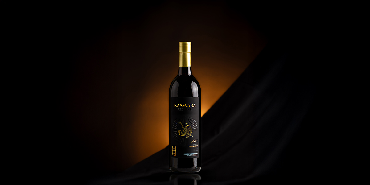
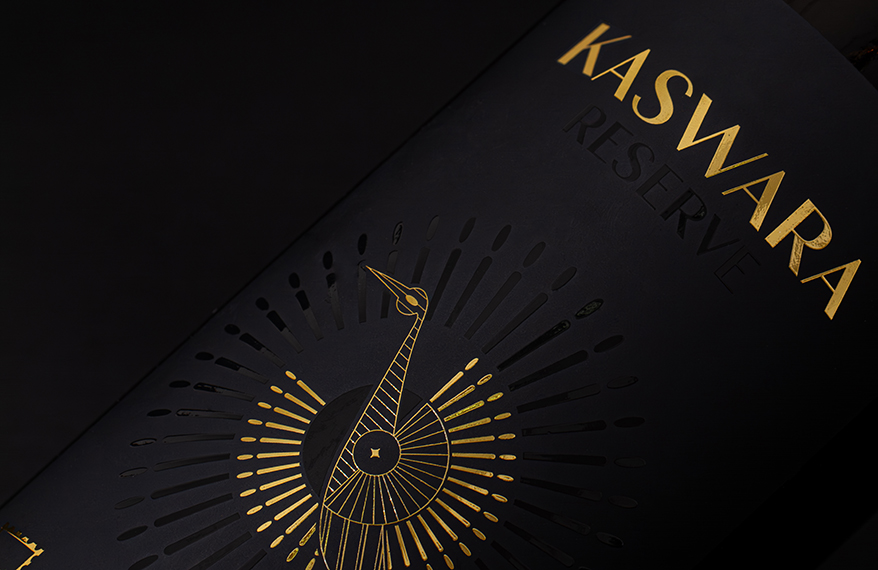
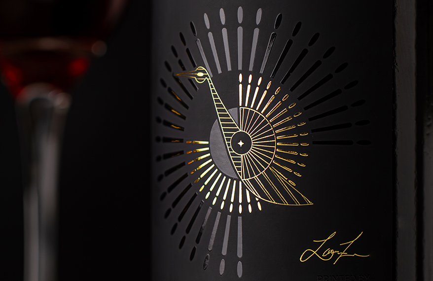
What is Maximalist Label Design?

In contrast to minimalism, maximalist design features a colorful style, rich in ornamentation, patterns, illustrations, and bold typography. This approach embraces contrast, texture, and complex details to tell a story and express brand personality directly through visuals.

Advantages of Maximalist Design:

  • Visually striking: Bold colors and busy visuals make products easily noticeable from a distance.
  • Effectively communicates brand character: Ideal for brands with a unique, creative identity that dares to stand out.
  • Great for energetic market segments: Such as products targeting younger audiences, snacks, or innovative beverages.

Disadvantages of Maximalist Design:

  • Potential for visual confusion: Too many elements may obscure key messages or important information.
  • Risk of overdesign: Without balance, the design may feel cluttered and less professional.

There’s no universally superior label design approach. Both minimalist and maximalist styles offer unique strengths and weaknesses. Choosing the right design depends on brand identity, product characteristics, and target market behaviour. With a well-aligned visual strategy, product labels can be a powerful communication tool to build appeal while increasing selling points.

Interested in developing a minimalist or maximalist label design? Consult your needs with Cahaya Jakarta Group through:

WhatsApp +62811949769  

Email: marketing@cahayajakarta.com

Check Other Blog

Bleed and Margin in Printing: Why Precision Matters In professional printing, small details can have a significant impact on the final result. Two technical

Shrink Sleeve Labels: A Premium Solution for 360 Degree Product Branding In this current fast-paced market, packaging plays a role far beyond merely protecting

Kaswara: A New Standard of Luxury Wine Label Design

Kaswara: A New Standard of Luxury Wine Label Design

Every creation tells a story of innovation. This month, that story unfolds with Kaswara — a premium wine label born to redefine elegance and exclusivity. Proudly introduce Kaswara, a premium wine label that redefines elegance and exclusivity. Designed to elevate the art of wine branding, Kaswara embodies sophistication not only through its visual appeal but also through its refined tactile experience. The name Kaswara carries a profound meaning: “a wise person.” This essence of wisdom is brought to life through the emblem of a Golden Peacock — a timeless symbol of beauty, serenity, and grace. Just as the peacock’s feathers captivate the eye with their natural allure, Kaswara’s design is crafted to leave a striking first impression and a lasting memory. From its bold, deep-black foundation to the subtle yet radiant golden embellishments, Kaswara speaks the language of luxury. Every detail was intentionally designed to reflect the character of premium wine brands — sophisticated, distinctive, and unforgettable.

The Story Behind the Design Kaswara’s

Aesthetic begins with its color palette. The deep black background creates an immediate sense of prestige, a perfect canvas for gold highlights to shine. Black in premium branding has always symbolized exclusivity, mystery, and timelessness — and here, it serves as the stage upon which the Golden Peacock motif comes to life.
The gold dome foil captures light in a way that feels alive, shifting in tone with each movement. It’s complemented by screen varnish that not only enhances detail but also invites touch — creating a multi-sensory experience for the consumer. The result? A label that doesn’t just look premium, but feels premium.

Technical Excellence

Kaswara is produced as a Pressure Sensitive Label (PSL), ensuring ease of application and superior adhesion, crucial for maintaining its pristine appearance on wine bottles over time.

  • Substrate: Entice Black — a cutting-edge material recently introduced by PT Theia Digilab Indonesia. This substrate stands out with its soft-touch matte finish and deep, pure-black color, offering a velvety smooth texture that enhances the tactile experience.
  • Printing: Digital Printing — delivering precise detail and color consistency, ensuring the design is produced flawlessly.
  • Finishing: Dome Foil & Screen Varnish — adding dimensionality, visual richness, and an irresistible texture that draws the consumer’s hand.

What Makes Kaswara Special?

  • Premium Material: Entice Black provides unmatched depth of color and a luxurious soft-touch surface.
  • Tactile Dimension: Dome Foil and Screen Varnish elevate the design from flat to dynamic, appealing to both sight and touch.
  • Exclusive Character: The combination of deep black, gold accents, and intricate detailing ensures Kaswara stands apart on the shelf.

Kaswara is more than a label — it’s a brand statement for those who believe premium products deserve premium presentation. From its deep-black foundation to the shimmering golden highlights, every detail was crafted to tell a story of elegance, wisdom, and beauty. With Kaswara, we are not only elevating label design but also shaping the future of premium product branding.

Ready to Elevate Your Brand with Premium Label Innovation? Let’s bring your vision to life with designs and materials that speak luxury and sophistication.

Check Other Blog

Liquid Vape Label: Things You Need to Know The vaping industry is growing rapidly. In Indonesia alone, the e-cigarette market is projected to reach

Label Materials: Functions, Types, and Applications Across Industries Labels are a crucial part of many industries, serving as both an identity marker and a

Embellishment Label: A Visual Strategy for Attractive and Professional Products

Embellishment Label: A Visual Strategy for Attractive and Professional Products

Product labels are a crucial element of packaging, serving not only to convey information but also to create a strong visual first impression of the brand. In a highly competitive market, an appealing label design has the power to increase consumer attraction and trust.

One effective way to enhance label appearance is through the use of embellishment techniques. Label embellishment refers to post-printing processes that add special visual or textural elements to enrich the design and convey a premium impression. This process is often referred to as a decorative finishing touch.

What Is Embellishment in Product Labeling?

Embellishment in product labeling refers to a series of decorative post-printing techniques aimed at enhancing the label’s visual appeal and perceived value. Unlike technical finishing, which serves a functional purpose (such as cutting or folding), embellishment focuses on aesthetics—elevating perceived quality and strengthening the product’s visual identity.

Common examples of embellishment include embossing, foil stamping, spot UV, and die-cutting. These techniques are widely used in premium packaging industries such as cosmetics, gourmet foods, and export products, as they help create a lasting visual and tactile impression on consumers.

Common Types of Label Embellishments

  1. Lamination (Glossy/Matte)
    A transparent protective layer that enhances visual appeal and label durability, available in glossy or matte finishes.
  2. Spot UV
    A selective high-gloss coating applied to key elements such as logos or brand names to create striking visual contrast.
  3. Embossing / Debossing
    Raised or recessed printing techniques that create a three-dimensional texture, adding a touch of elegance and exclusivity.
  4. Foil Stamping (Hot/Cold)
    The application of metallic finishes such as gold, silver, or holographic foil to enhance visual appeal and convey luxury.
  5. Die-Cutting
    Custom-shaped label cutting that visually distinguishes the product from standard label formats.
  6. Varnish
    A clear liquid coating—either lightly glossy or matte—applied directly to the label surface, offering subtle protection and an aesthetic finish without significantly increasing material thickness.

Choosing the Right Embellishment Technique for Your Product Design

After understanding the various types of embellishment, it is essential to choose the technique that best aligns with your design needs. The selection should be tailored to the product’s characteristics and the target market segment.

In addition to enhancing visual style, the label material should also be carefully considered. Certain embellishment techniques require smooth or flat surfaces to achieve optimal and precise results. When chosen appropriately, embellishment not only enhances visual appeal but also strengthens the product’s competitiveness in the marketplace. Beyond technical and aesthetic benefits, embellishment also plays a strategic role in building brand image and increasing product value.

The Benefits of Embellishment for Packaging Branding

  1. Enhances Visual Appeal
    Embellishments create a premium, eye-catching label design that stands out on retail shelves and conveys a professional impression.
  2. Provides Additional Protection
    Techniques such as lamination and varnish offer protective functions, shielding the label from moisture, friction, and UV exposure.
  3. Improves Label Durability
    Embellished labels tend to be more resistant during distribution and storage, maintaining color vibrancy and structural integrity.
  4. Supports Brand Differentiation
    Consistent use of embellishment techniques can become a unique visual signature, distinguishing the brand from competitors and reinforcing brand identity.

Label embellishment is more than just a visual enhancement—it is a branding strategy that adds value to your product. The combination of aesthetic elements and protection creates a premium impression, enhances marketability, and extends label longevity. However, not every embellishment is suitable for all product types. A deeper understanding of your product is necessary to determine which technique truly aligns with its content and function.

Interested in giving your product a premium touch through the right embellishment?

Consult your needs with Cahaya Jakarta via:
marketing@cahayajakarta.com

Check Other Blog

Minimalist Label Design & Alternative Styles to Elevate Your Packaging In the marketing thing, a label is more than just an identity marker. Its

Enhancing Your Products though Embossed Label In the world of product branding, first impressions matter—and one powerful way to elevate your product’s shelf presence