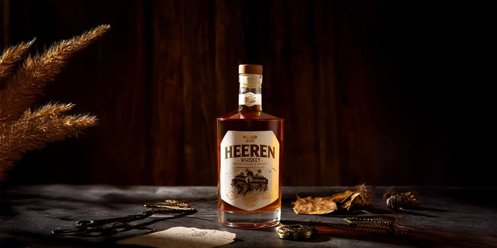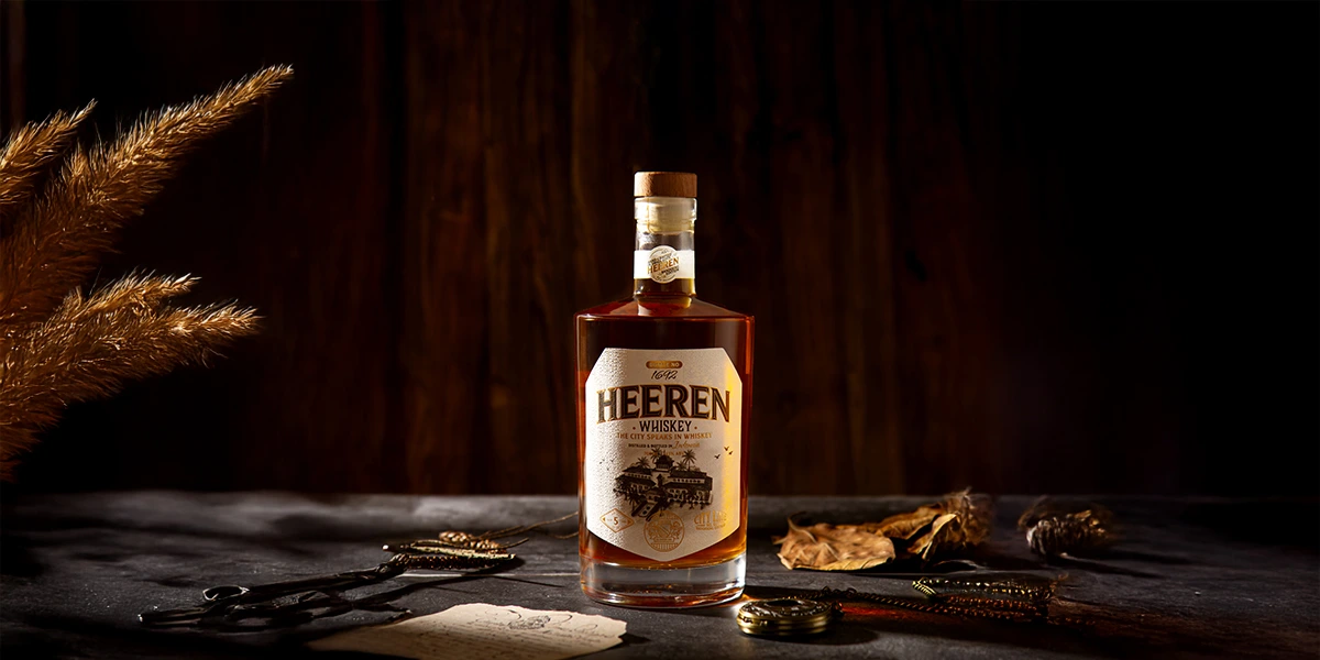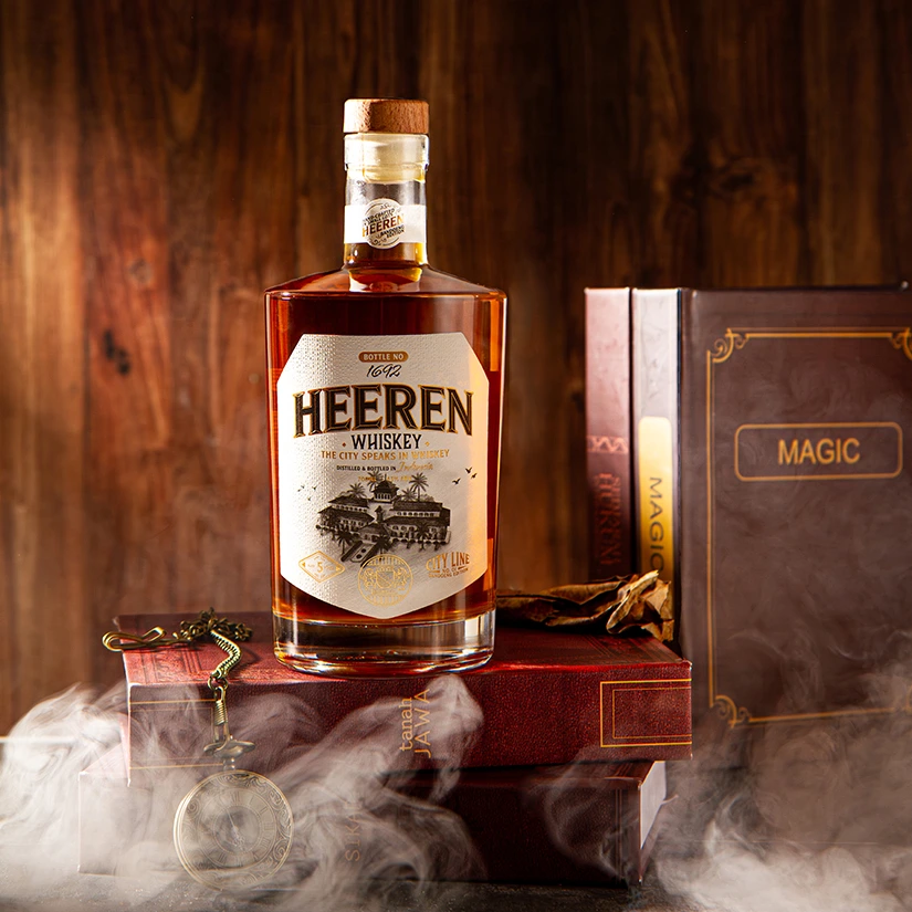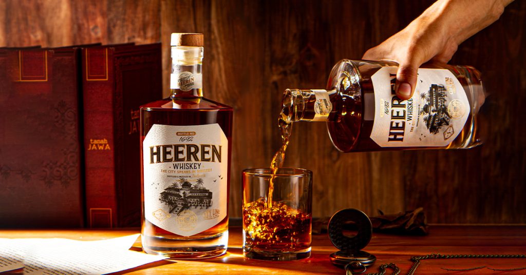
Every masterpiece begins with a story worth telling. This month, that story continues with Heeren — the second creation in Cahaya Jakarta Group’s 2025 Label Innovation Project. Designed to honor history while embracing modern craftsmanship, Heeren is more than a label — it is an ode to legacy, elegance, and timeless artistry.
Inspired by the colonial era and built around the theme “Pride of Heritage,” Heeren captures the soul of premium whisky branding through a deeply rooted cultural narrative. Its name, derived from Dutch and meaning “nobleman,” reflects a sense of classic luxury — a perfect mirror to the distinguished character of world-class spirits.
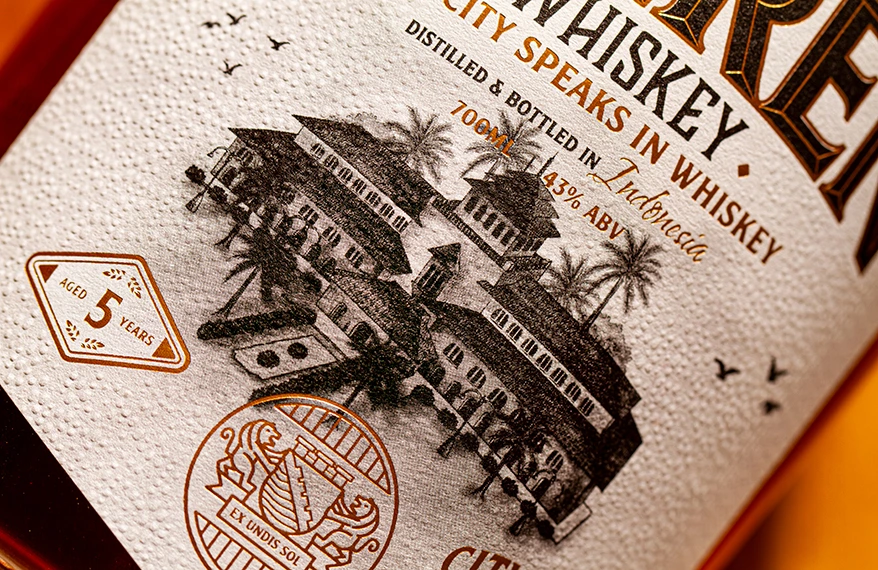
At the heart of Heeren’s identity lies a hand-drawn illustration of the iconic Gedung Sate, a symbol of Bandung’s rich historical tapestry. This personal, artisanal touch forms the emotional anchor of the design, bringing authenticity and craftsmanship into every stroke. The crest, inspired by Bandung’s old emblem, reinforces its heritage-driven visual language — grounding the label in both prestige and cultural depth.
Heeren is the meeting point between vintage charm and modern refinement. Through the interplay of hotstamp gold and precise embossing, the label invites both visual admiration and tactile engagement. It is a design meant to be seen, felt, and remembered.
The Story Behind the Design
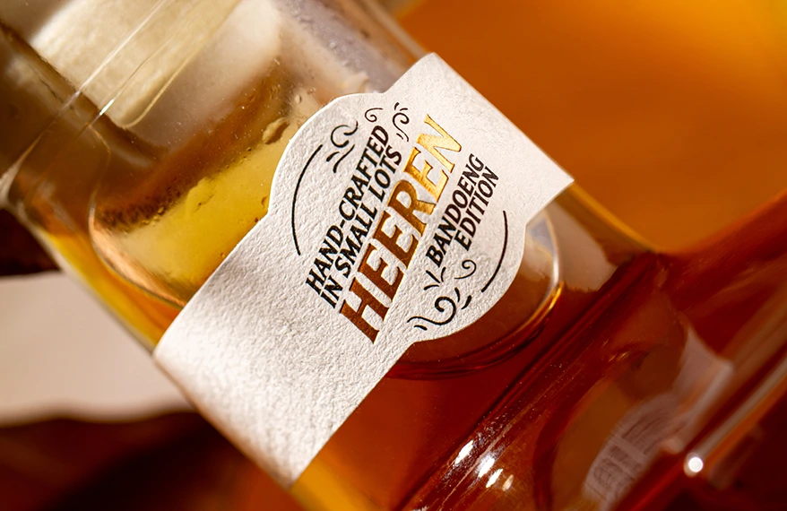
Heeren’s aesthetic is anchored in the harmony between history and luxury. The textured surface of Rustique Blanc — a natural, tactile substrate reminiscent of vintage paper stock — sets the foundation for its classic appeal. This material choice reflects the timeless qualities of handcrafted labels from the past, making the design feel warm, intentional, and deeply human.
The hand-drawn Gedung Sate illustration becomes the soul of the piece, evoking a sense of place, culture, and identity. Paired with a noble crest inspired by early-era Bandung iconography, Heeren proudly carries the heritage narrative into the modern world.
The gold accents tell another part of the story — one of prestige, elegance, and understated opulence. The Hotstamp Gold shines with a subtle brilliance, while the Emboss adds dimensionality, depth, and texture, ensuring Heeren feels as premium as the whisky it represents.
Technical Excellence
Heeren is produced with the highest attention to detail, ensuring quality that matches its luxurious concept.
Type: Pressure Sensitive Label (PSL)
Substrate: Rustique Blanc — a premium textured paper with a natural, handcrafted feel
Printing: Digital Printing — enabling precise details and rich tonal execution
Finishing:
- Hotstamp Gold for luminous metallic highlight.
- Emboss for depth and tactile sophistication
Each component was chosen to elevate the storytelling and intensify the premium experience.
What Makes Heeren Special?
1. A Celebration of Craftsmanship
Heeren stands out with a label built on artistry — from the hand-drawn landmark to the textured substrate that enhances its vintage identity.
2. Rich Tactile Experience
The combination of Hotstamp Gold and Emboss brings dimension and elegance, transforming the label into a sensory encounter.
3. Authentic Heritage Expression
The design balances the dignity of historical references with the polish of modern techniques, making Heeren both meaningful and luxurious.
Heeren is more than a decorative element — it is a brand statement for those who believe premium whisky deserves a narrative as rich as its flavor. With its blend of heritage, craftsmanship, and modern finishings, Heeren stands as a testament to the beauty of honoring the past while designing for the future.
Ready to Elevate Your Brand with Heritage-Driven Premium Labels?
Let’s bring your vision to life with innovative designs, refined materials, and craftsmanship that speaks to your brand’s unique story.