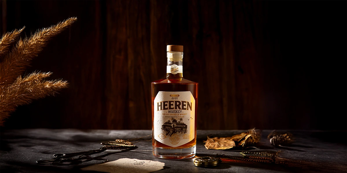
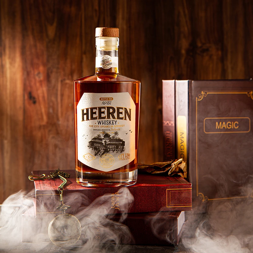
As a premium beverage, Heeren embodies the artistry of fine whisky labeling, where heritage meets craftsmanship through texture and thoughtful details. With the theme “Pride of Heritage,” Heeren draws inspiration from the aesthetics of the colonial era.
The name Heeren, derived from Dutch meaning “nobleman,” reflects sophistication and class, perfectly resonating with the essence of a vintage whisky brand.
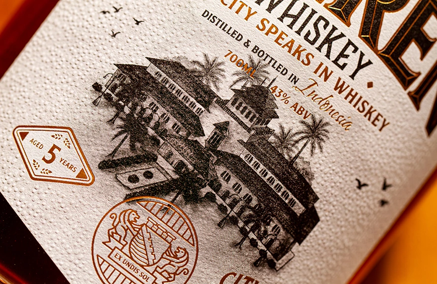
The hand-drawn illustration of Gedung Sate, Bandung’s most recognizable architectural landmark from that period, adds a personal and authentic touch, while the crest at the center references a historical insignia of the city.
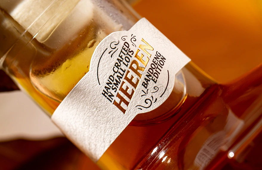
Crafted on Rustique Blanc, the label features a tactile, handmade appearance and feel that perfectly aligns with Heeren’s vintage whisky aesthetic.
The substrate’s natural texture enhances its authenticity, while Hotstamp Gold introduces a subtle metallic glow that contrasts beautifully against the matte surface.
The Emboss finish deepens the sensory experience, emphasizing key details such as the crest and typography to evoke a refined sense of heritage and craftsmanship.
Contact Us