Choosing the right label material is a critical decision that directly affects a product’s appearance, durability, and overall brand perception. Labels are more than just informational stickers—they represent the brand, communicate quality, and often influence purchasing decisions.
However, many businesses make avoidable mistakes when selecting label materials, leading to higher costs, damaged products, and reduced customer trust. This article explores some of the most common mistakes and how to avoid them.
1. Ignoring Product Usage
One of the biggest mistakes companies make is choosing label materials without considering how and where the product will be used. Every product has a unique environment, and labels must be able to withstand those conditions throughout the product’s life cycle.
- Environmental Factors: A label designed for indoor use may fail quickly when exposed to water, heat, sunlight, or friction.
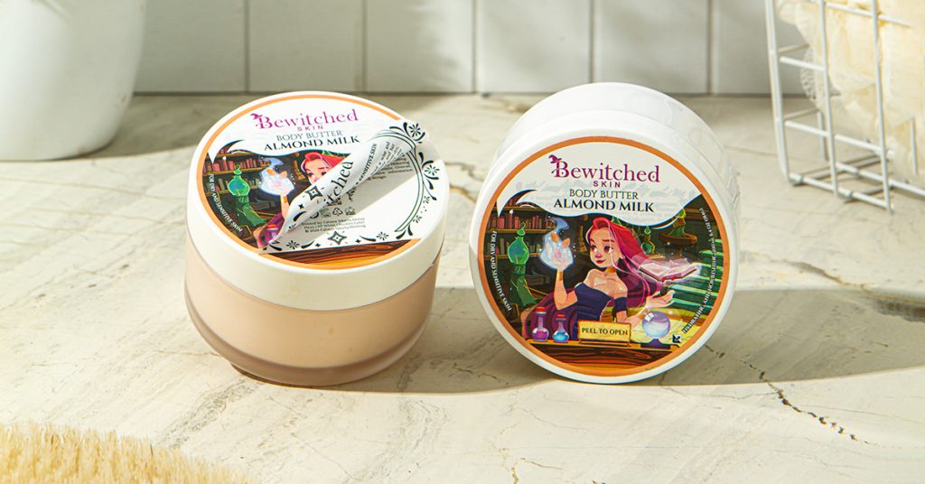
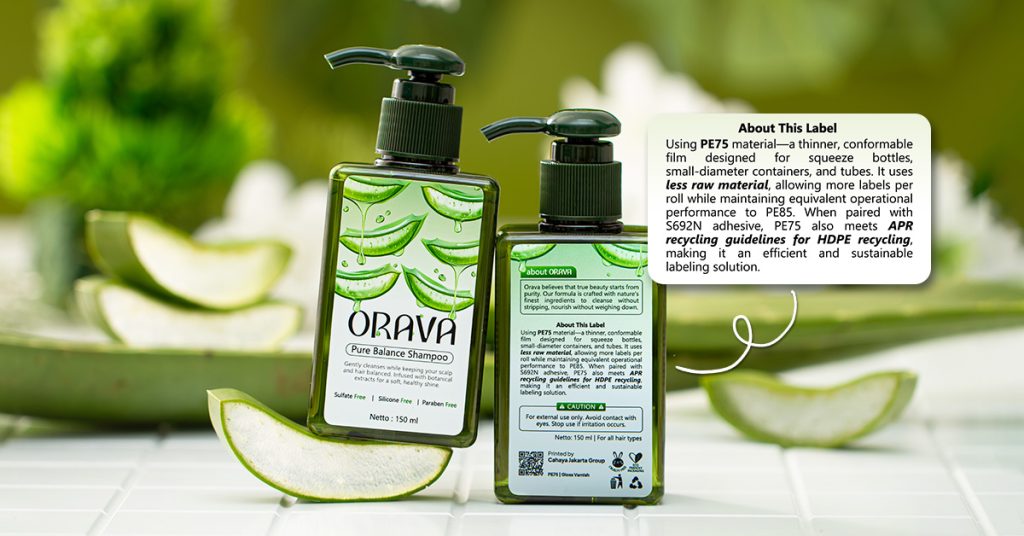
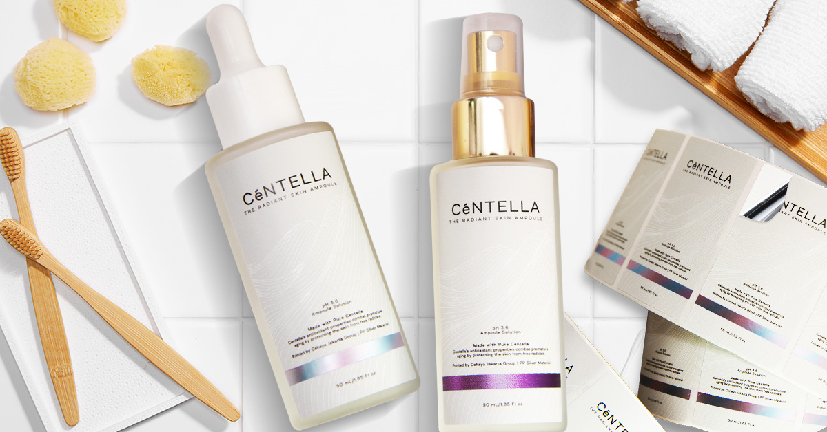
- Industry-Specific Needs: Products like beverages, cosmetics, or industrial chemicals face moisture and temperature changes. For specialized needs, some brands utilize a label booklet to provide comprehensive information without sacrificing design space.
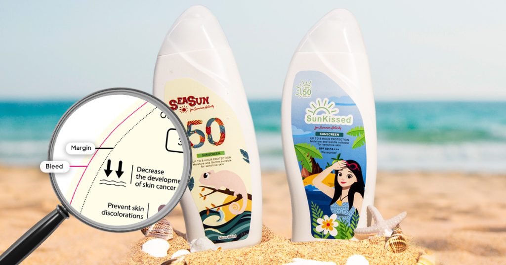
- Compliance Risks: In food or pharmaceuticals, if a label deteriorates, essential information like ingredients or expiration dates may be lost.
Solution: Analyze how the product will be stored, transported, and used. Choosing materials that are waterproof, heat-resistant, or abrasion-resistant as needed will help ensure the label remains intact.
2. Focusing Only on Price
While budget considerations are important, choosing the cheapest option often leads to long-term problems. Low-cost label materials usually lack durability and resistance to environmental factors.
- Brand Perception: Customers often associate poor label quality with poor product quality. To enhance shelf appeal and perceive higher value, some brands are now exploring label printing innovation with 3D effects.
- Security Risks: Cheaper materials are easier to replicate. Brands looking to prevent forgery should consider anti-counterfeit printing technologies such as VDP or invisible ink.
- Hidden Costs: Replacing damaged labels or dealing with customer complaints can result in higher overall costs than investing in quality materials from the start.
Comparison of Material Investment:
| Low-Cost Labels | Quality Label Materials |
|---|---|
| High risk of peeling/fading | Long-term durability |
| Negative brand impact | Professional brand image |
| Potential relabeling costs | Reduced waste and disruption |
3. Not Matching Material with Printing Method
Not all label materials are compatible with every printing technique. Choosing the wrong combination can lead to:
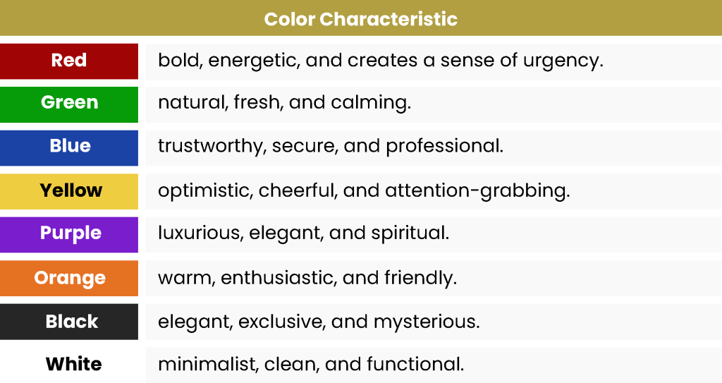
- Poor Print Quality: Issues like smudging or uneven prints. It is also vital to understand the role of color and font in product label design to ensure the final output remains legible and attractive.
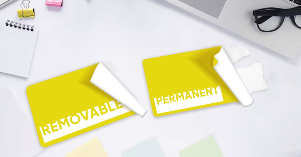
- Adhesion Issues: Even if the label looks good, it may not bond properly to the product surface. This is why understanding the types of label adhesives, whether permanent or removable, is essential for a successful application.
Conclusion
Choosing the right label material requires more than simply selecting what looks good or costs the least. By evaluating environmental conditions, balancing cost with durability, and ensuring compatibility between materials and printing techniques, businesses can make smarter choices.
Consultation & Support
For those looking to explore suitable label and printing solutions based on specific product needs, Cahaya Jakarta Printing is available for further consultation:
- WhatsApp: https://wa.me/62811949769
- Email: marketing@cahayajakarta.com