In today’s competitive marketplace, product label design plays a vital role in capturing consumer attention on crowded shelves. A well-crafted label not only communicates essential product information but also shapes consumer perceptions of quality, style, and brand personality.
Among the many visual elements in label design, two stand out as the most influential: color and font. Together, they form the foundation of a strong brand identity, influence purchasing decisions, and help products stand out in the market.
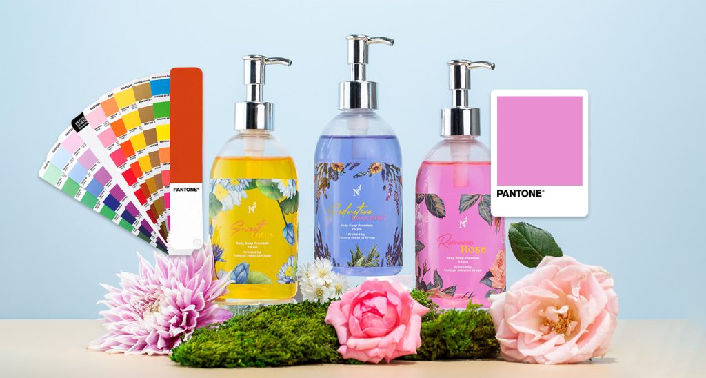
The Role of Color in Product Label Design
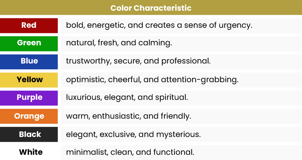
1. Color Psychology in Label Design
Color psychology is a powerful tool for influencing consumer emotions and behavior. Each color evokes different feelings and associations:
By applying color psychology in product label design, brands can choose a palette that resonates with their target audience while reinforcing brand values.
2. Color and Brand Identity
Consistency in color usage is critical for brand recognition. Iconic brands like Coca-Cola with its vibrant red or Starbucks with its signature green demonstrate how color strengthens consumer recall. In label design, a consistent color palette helps products stand out and remain memorable in competitive retail environments.
3. Effective Color Combinations
The right color pairing enhances both readability and aesthetic appeal:
- High contrast improves text clarity, making important product information easy to read.
- Harmonious colors create an attractive, cohesive visual experience.
The Role of Fonts in Product Label Design
1. Typography Psychology
In product label design, typography plays an important role because font selection shapes the first impression consumers form about a product. Classic fonts such as Times New Roman or Garamond are often considered elegant and classy, while modern fonts such as Helvetica convey a clean and professional look. This shows that typography is not merely a visual element but also a medium that conveys brand identity and product character.
Beyond the style of the font itself, other factors such as size, weight, and spacing significantly affect readability and overall visual comfort. With the right typography, labels can be both informative and emotionally engaging, building trust and encouraging consumer interest.
2. Readability and Informational Function
Clarity is a priority in label typography. A readable font ensures that consumers can quickly access important details. Implementing a text hierarchy—such as distinct font sizes for the product name, description, and supplementary details like ingredients or expiration dates—improves both usability and aesthetics.
3. Fonts and Product Personality
The right font reinforces brand personality. Products with a premium positioning often use refined typography to highlight exclusivity, while products targeting a younger or more dynamic market tend to prefer styles that feel strong and modern. Aligning typography with product identity helps strengthen brand storytelling and build a deeper connection with consumers.
Combining Colors and Fonts for Maximum Impact
Strategic integration of colors and fonts ensures a strong, cohesive product label design. For instance, a wellness brand might use soft green tones paired with a clean sans-serif typeface to communicate natural, healthy, and modern values.
Common Mistakes to Avoid in Product Label Design:
- Low-contrast combinations that reduce text readability
Poor contrast makes text difficult to read, especially on small labels. Important information may be overlooked and reduce visual appeal. - Using too many font styles, making the design look cluttered
Using more than two or three font types makes the label lose consistency. Instead of looking creative, the label risks appearing unprofessional and confusing. - Choosing colors that conflict with the brand’s identity
Inconsistent colors undermine brand identity, making it harder for consumers to recognize and differentiate the product.
Practical Tips for Label Designers:
- Stick to a brand-consistent color palette
Consistency strengthens brand identity and makes it easier for consumers to recognize the product on a crowded shelf.
- Limit font usage to a maximum of two types
Combining different fonts can clarify text hierarchy, but too many can be distracting. Use two complementary font types. - Ensure readability remains optimal at small print sizes
Labels are often printed in compact sizes. Always test by printing a sample at the actual size to make sure text stays legible and visual details remain clear.
An effective product label design is more than just visually appealing—it’s a strategic tool that blends color psychology and font selection to communicate brand identity, influence purchase decisions, and leave a lasting impression.
By combining well-chosen colors with the right typography, brands can create labels that not only attract attention but also enhance trust and recognition. When executed thoughtfully, these visual elements give products a competitive edge in today’s crowded marketplace.
Ready to improve your product labels with the right color and typography?
Let’s shape your label with a clear color palette, smart font pairing, and strong readability so your product stands out and stays consistent with your brand. You can also explore our label design consultation, packaging material sourcing, digital label printing, and labeling services for production support.
We also provide pressure-sensitive labels, shrink sleeves, and in-mould labels, plus a wide range of embellishments like foil stamping, spot UV, embossing, debossing, and textured finishes to match your product positioning.