
BEER, WINE & SPIRIT-Kaswara

BEER, WINE & SPIRIT

Kaswara
Drink the Color, Feel the Energy

Type

Pressure Sensitive Label

Substrate

Entice Black

Printing

Digital

Finishing

Dome Foil, Screen Varnish

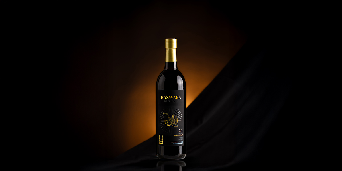
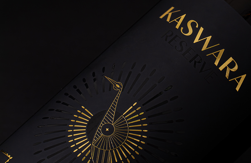
Kaswara aimed to differentiate itself from other wine brands through elegant and sophisticated packaging. As a premium beverage brand, Kaswara embraced the timeless allure of black for its label, creating a bold yet refined statement of elegance and luxury. The name Kaswara, symbolized by a golden peacock, evokes beauty and grace, reflecting the qualities often found in both fine wines and exquisite design.

The label is crafted on Entice Black, a deep black substrate with a soft-touch matte finish, perfect for a dramatic contrast and appeals to both sight and touch. Enhanced with Dome Foil for a radiant golden dimensional shine and Screen Varnish for delicate, tactile texture, Kaswara’s packaging delivered a refined multisensory experience.

This thoughtful design perfectly captures Kaswara’s commitment to elegance and premium quality, making Kaswara stand out distinctively in the world of fine beverages.

Our Solution

Pressure-Sensitive label

Labels that stick like a sticker, no heat or glue needed. They're easy to apply, stay in place, and look great on all kinds of packaging.

Entice Black

A rich black color material with a velvety matte finish and soft touch surface that enhances both visual depth and tactile effect. Designed to evoke a sense of luxury and refinement, Entice Black offers a silky, indulgent texture that invites interaction.

Dome Foil

Dome Foil combines the eye-catching properties of foil, such as metallic or holographic effects, with the added dimension of embossing.

Screen Varnish

A specialized varnish technique that adds raised, textured finishes to specific areas of a label. Screen Varnish enhances visual depth and delivers a tactile effect.

Get intouch with us!

Have some questions? Click on the form below.

Bleed and Margin in Printing: Why Precision Matters

Bleed and Margin in Printing: Why Precision Matters

In professional printing, small details can have a significant impact on the final result. Two technical elements that are often overlooked but extremely crucial are bleed and margin. Understanding and applying these two elements correctly is key to achieving high-quality prints and avoiding layout errors.

Bleed refers to the area of the design that extends beyond the final cut size. Meanwhile, margin is the empty space surrounding the main content, ensuring that important elements aren’t placed too close to the edge of the page. Both serve to prevent cutting errors and maintain a professional print appearance.

Without proper bleed and margin settings, prints may look imprecise, with parts of the design cut off or unwanted white edges appearing along the trim.

What is Bleed?

Bleed is an extra area around the edges of the design that ensures background colors or images remain intact after trimming. The standard bleed size is typically set to 1,5 mm. In design documents, the bleed area is usually marked as a line outside the trim size, and any graphic elements or background colors intended to reach the edge should extend beyond this line.

What is Margin?

Margin is a safe area that keeps important text or elements from being too close to the edge of the paper. It ensures readability and a clean appearance, even if there’s a slight shift during the trimming process. Typically set to 1 mm or more.

The difference between a margin and a safe zone is quite subtle. The safe zone is the area within the margin where all the important elements such as text and logos should stay to avoid being trimmed off, while the trim line marks the final edge of the printed product after cutting.

Why Bleed and Margin Are So Important

The trimming process in mass productions isn’t always 100% precise. Cutting machines can have a shift tolerance of 1-2 mm, which can cause noticeable issues if bleed and margin aren’t used correctly. Without bleed, unwanted white edges may appear. Without margin, text or logos can be cut off and damage readability. 

Proper implementation of bleed and margin also helps maintain a professional appearance in print results. A neat and symmetrical design shows attention to detail and enhances the credibility of printed products like brochures, business cards, catalogs, or packaging.

Precision in print design is not only defined by attractive visuals, but also by applying basic techniques such as bleed and margin. Both play a major role in preserving the aesthetics, functionality, and quality of the print. With solid bleed and margin settings, every print project will look more professional, durable, and free from cutting errors that ruin its appearance.

Want to discuss your design and label? Consult your needs with us through marketing@cahayajakarta.com

Check Other Blog

Cahaya Jakarta: Quality Label & Packaging Solutions for Your Business In an increasingly competitive market, labels and packaging are no longer just product complements.

Why You Should Choose Cahaya Jakarta For Your Labels and Packaging Solutions Cahaya Jakarta is a label printing company serving a variety of industries,